Greater Bay One
The Bay Area is the only "one"Enjoy hidden luxury in the green waves
 | |||||
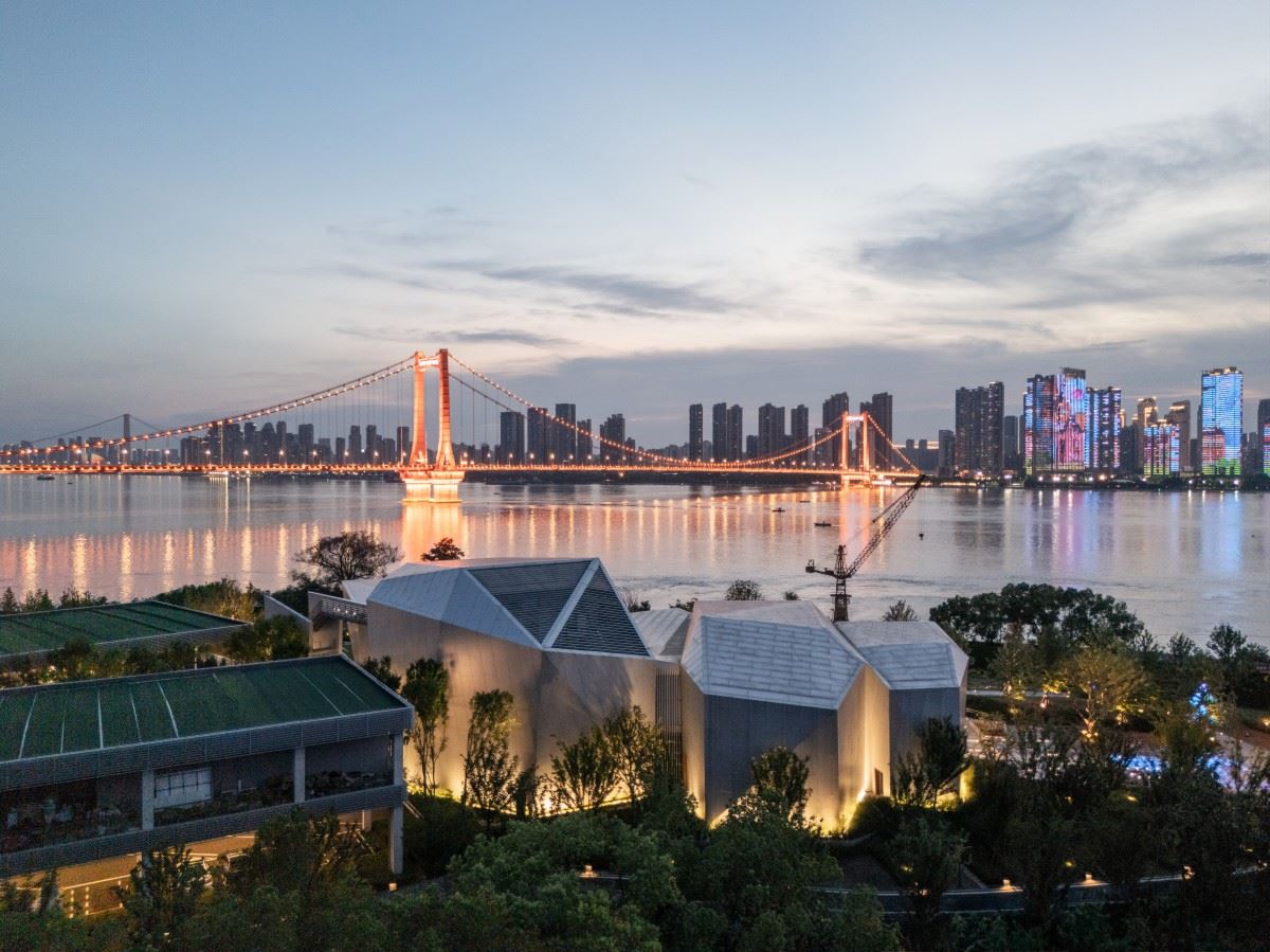
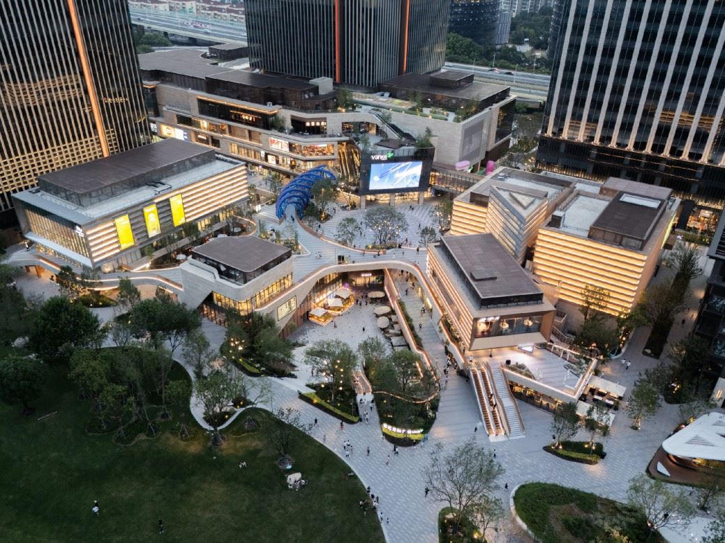
In the green waves Enjoy hidden luxury When the blue waves spread to the distance Shadows mottled The outline of the light outlines a graceful arc The name“Greater Bay One”was born from this The name "was born from this |  | ||||
 | Main graphic "Xi" criss-crossing The fan-shaped rounded corners are delicate and soft Simplicity and dignity are reflected in the details Fluent Chinese and English fonts Let people feel the flow and vacation style of "Bay" The rigorous comparison between the design of the logo and the environment In stark contrast The light and the water resonate Inject a unique vitality into the space | ||||
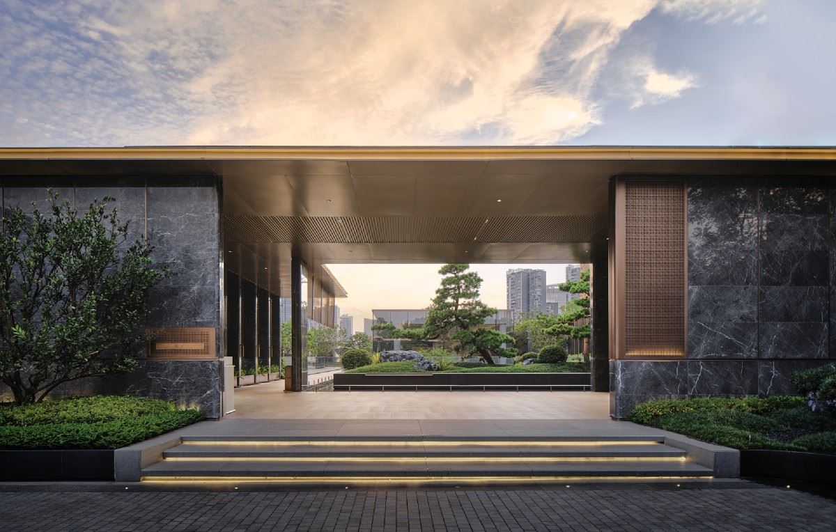
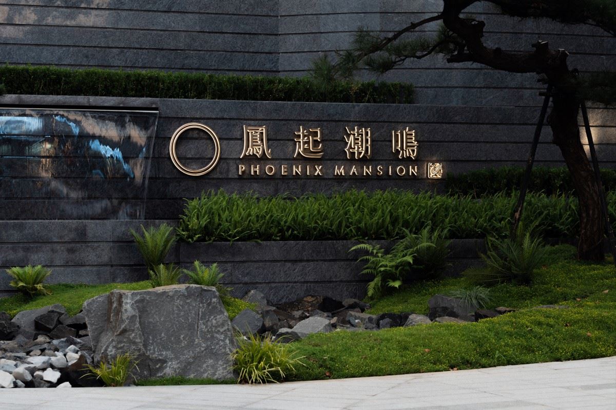
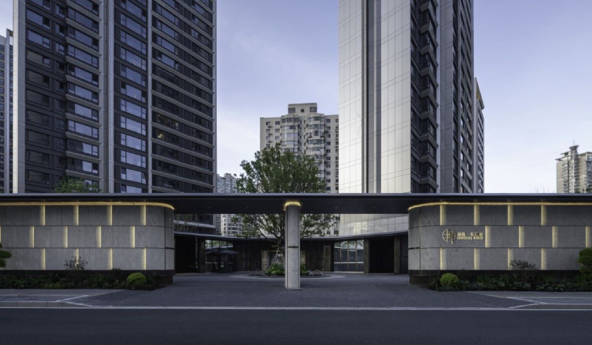
From logo to logo We use a unified design language Transmit a poetic and leisurely life atmosphere The overall design idea of the logo It is to achieve a harmonious symbiosis between the logo and the environment The uniqueness of the regression project |  | ||||
 | In a minimalist style Micro arc of logo body extension LOGO Skillfully integrated into the environment The embellishment of greenery and luxury stone is just right Logo design for each location All carefully considered Echoes the material and color scheme of the environment Let the overall atmosphere blend and sublimate in light and shadow | ||||
The interior is made of a large amount of stone and retro metal The presence of the logo is even heavier Visual pursuit of the ultimate sense of symmetry These details all tell the dignity of the Bay Seal |  | ||||
 | In the garage section Height limit signs break with conventional design Highlight key messages in a minimalist style Micro-arcs become design highlights The wall pillars and the ground together deduce the harmonious beauty of the LOGO 项目位置:广东-珠海 项目名称:珠海华发·湾玺壹号 项目业主:华发股份 标识设计:柏熙标识 标识团队: 代健美、章春萍、王辰橹 建筑设计:GAD 景观设计:JTL STUDIO 室内设计:CCD/SLD/真工设计/李玮珉/程绍正韬 标识摄影:DO STUDIO | ||||